A Look At 2023’s Colour Palette, Packaging Colour, and Brand Influence in Custom Packaging Design

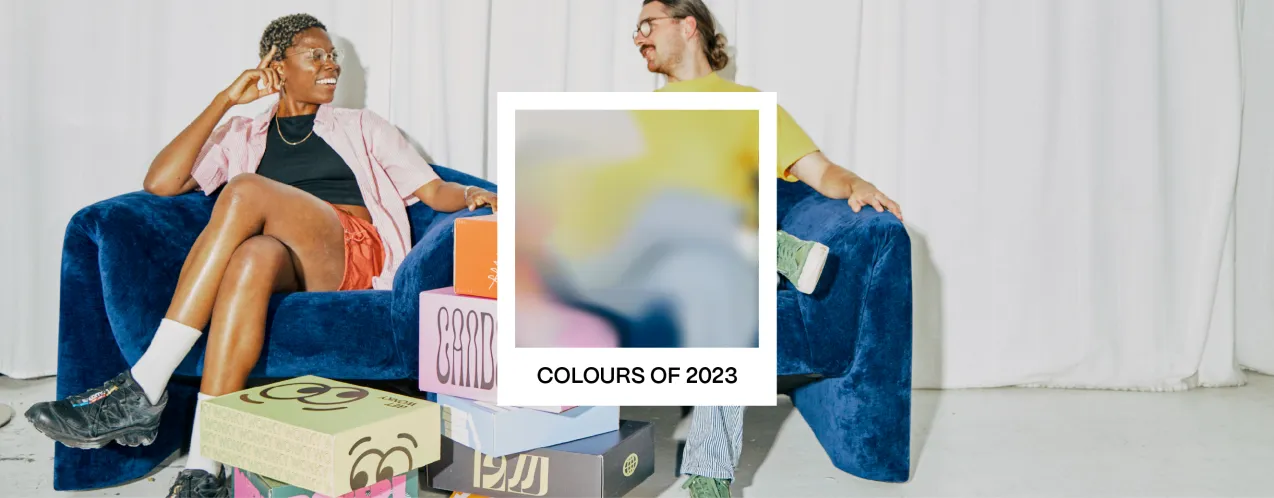
Feast your eyes on colour inspiration from 2023’s predicted colour trends, set to take off in the new year across packaging, fashion, interior and digital design.
In the list of colour trends for 2022, we saw a vivid, brave, and fun colour palette emerge this year. We've once again consulted the colour experts for the upcoming year.
We’re not sure what Pantone does year-round as the approved global authority on colour. However, we're delighted to see the sources of their annual trend forecasts, which identify the colours that will influence the world of design in 2023.
Take colour inspiration from the most recent trends for your custom packaging design to stay ahead of the curve for your brand.

The reality behind consumer behaviour and packaging colour
For more than 20 years, Pantone has chosen a colour for the year. A group of experts search the world for fresh colour influences as part of this process. From entertainment to cutting-edge technology to lifestyles, these factors can all have an impact.
Consumer behaviour is influenced by colour in many different ways, from impulsive purchases to cost-effective investments.
Brands can gain knowledge to use colour to appeal to customers on a greater scale by influencing their mood and being alluring to their emotions with the help of insights from qualitative market research techniques.
How come the Pantone colour changes each year, then? There is much more to it than just colour psychology.
As the world evolves and numerous circumstances take place, the larger community may encounter a particular context that will strengthen their emotional bond with a particular colour spectrum.
Rising inflation, international conflicts, and the climate crisis are just a few of the responses to the present state of affairs that are reflected in 2023's custom packaging design colour trends.
But first, a nod to 2022 in colour choice
The Pantone colour of 2022 was Very Peri. A welcoming and warm blue colour that encourages unrestrained expression and experimentation while exuding a sense of trust and a joyful outlook.
This vibrant blue has a dynamic presence and a whimsical quality that encourages haphazard colour harmonies and unplanned colour statements.
PANTONE 17-3938 Very Peri, which has a futuristic vibe, assumes distinct appearances when used with various materials, finishes, and textures.
While minimalist designs and chic, sleek product packaging were popular in a previous couple of years, in 2022 the emphasis has shifted to practicality, sustainability, and organic, handcrafted design.
Very Peri has been the ideal shade for many graphic and multimedia design applications, as well as packaging because it embodies a good-natured warmth that rapidly engages the eye whether it appears in a physical material or a fictional digital world.

Pantone’s colour of the year: Digital Lavender
The collaboration between WGSN and Coloro has confirmed that Digital Lavender will be the Color of the Year for 2023.
While Pantone decided that Very Peri, a cheerful periwinkle blue, was the happiest and warmest colour for 2022, Digital Lavender is very similar to Very Peri and will be very popular in the upcoming months.
Consumer electronics, digital wellness, ebullient lighting, and home goods will all benefit from this purple. Its sensory qualities make it ideal for wellness products, therapeutic procedures, and self-care rituals.
While the delicate and subtle tones of lavender give it a feminine and self-care vibe, its proximity to blue-hued colours gives it an edge.
A broader view of the colour will represent a variety of human moods that are beginning to emerge, bringing the best in terms of communicating a sense of calmness and joy that calms our minds, which is something we are all anticipating.
Users of Digital Lavender enjoy it just as much as creative professionals do. The cheerful yet calming, almost healing shade creates a calming, bright, and friendly effect by blending in with the currently fashionable earth tones and natural yellows in this way.
According to studies, looking at digital lavender creates feelings of peace and tranquillity. These colour perceptions are brought on by the corresponding wavelengths of the various tints.

More trends to expect for Packaging Colour and Packaging Design
Other colours planned for 2023 include Luscious Red, Sundial, Tranquil Blue, and Verdigris.
It's not necessary for your display's colours to exactly match your brand's colour palette. This is especially true of seasonal decorations, which take on the hues of approaching holidays.
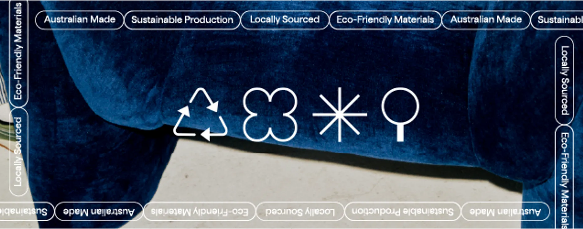
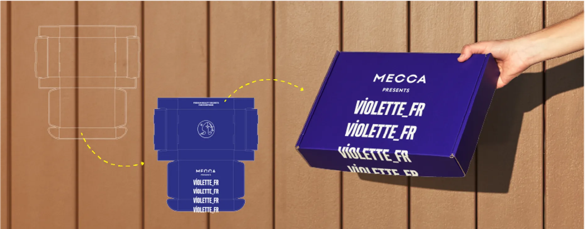
It is a proven fact that good custom packaging design serves as an ambassador for your brand and that poor packaging can effectively make an excellent product unmemorable.
Colour marketing is an effective tool. Learning how to use it for brand and retail marketing can have a significant impact on your bottom line and in-store customer experience.
Your choice of colour for product packaging can be related to a variety of other trends. Depending on your objectives, you can incorporate inventive fonts, transparent packaging, simplistic designs, secure packaging, illustrations, storytelling, the use of QR codes, vintage packaging, sustainable packaging, and many other solutions.
When the colour scheme of a campaign or product is carefully considered and planned, brand recognition, product discovery and differentiation, influences and associations, and holiday marketing can all greatly benefit.
The newest colour packaging design trends are a reaction to and reflection of the times if there is one thing we can infer from them.
People are responding to happy and well-known colours and styles in custom packaging design in response to all the uncertainty and unrest of the past year, whether for escapism, nostalgia or finding hope in the future.
Ready to elevate your brand experience? Visit our online store to get started.